Box Widget
Overview
The Box widget is the most fundamental building block in mGui. It is a rectangular container that can be used as a background, a panel, or a parent for other widgets. Boxes support borders, rounded corners, fill colors, and visibility control.
Enable
No feature flag required — the Box widget is always available.
Creation
mgui_widget_t* box = mgui_allocate_widget(
    parent,           // parent widget (or NULL for screen)
    MGUI_WIDGET_BOX,
    (mgui_area_t){x, y, width, height},
    MGUI_COLOR_WHITE   // fill color
);
API Reference
Geometry
// Move the box
mgui_widget_set_pos(box, int16_t x, int16_t y);

// Resize the box
mgui_widget_set_size(box, int16_t width, int16_t height);

// Align inside parent
mgui_widget_align(box, MGUI_ALIGN_CENTER);
mgui_widget_align(box, MGUI_ALIGN_TOP_LEFT);
mgui_widget_align(box, MGUI_ALIGN_BOTTOM_RIGHT);
Appearance
// Change fill color
mgui_widget_color_change(box, MGUI_COLOR_BLUE);

// Set border (color + width in pixels)
mgui_widget_border_property(box, MGUI_COLOR_BLACK, 2);

// Set rounded corners (radius, filled = true → filled rect, false → outline only)
mgui_widget_radius_property(box, 10, true);

// Show / hide
mgui_widget_set_visible(box, false);
Events
static void my_box_click(mgui_widget_t* obj, mgui_event_t event) {
    if (event == MGUI_EVENT_CLICKED) {
        // handle click
    }
    if (event == MGUI_EVENT_CLICK_HOLD) {
        // handle long press
    }
}

mgui_widget_click_handler(box, my_box_click);
Alignment Constants
| Constant | Description |
|---|---|
MGUI_ALIGN_CENTER |
Center horizontally and vertically |
MGUI_ALIGN_TOP_LEFT |
Top-left corner of parent |
MGUI_ALIGN_TOP_CENTER |
Top edge, horizontally centered |
MGUI_ALIGN_TOP_RIGHT |
Top-right corner |
MGUI_ALIGN_CENTER_LEFT |
Vertically centered, left edge |
MGUI_ALIGN_CENTER_RIGHT |
Vertically centered, right edge |
MGUI_ALIGN_BOTTOM_LEFT |
Bottom-left corner |
MGUI_ALIGN_BOTTOM_CENTER |
Bottom edge, horizontally centered |
MGUI_ALIGN_BOTTOM_RIGHT |
Bottom-right corner |
MGUI_ALIGN_RIGHT_OF |
Place to the right of a reference object |
MGUI_ALIGN_BELOW |
Place below a reference object |
Examples
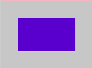
Basic Colored Box
Light gray background with a purple panel — the default look.
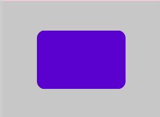
Rounded Card
A purple rounded card on light gray — default color, rounded corners only.
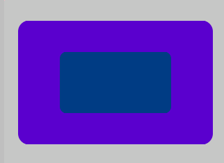
Nested Boxes (Container Pattern)
Purple rounded outer card with a small navy inner panel centered inside — creates clear visual depth.
{
  "elements": [
    {
      "type": "box",
      "name": "Screen",
      "x": 0, "y": 0, "w": 320, "h": 240,
      "color": "0xC6C6C6",
      "children": [
        {
          "type": "box",
          "name": "Outer",
          "x": 0, "y": 0, "w": 280, "h": 180,
          "color": "0x5900CC",
          "align": "MGUI_ALIGN_CENTER",
          "corner": { "radius": 16, "filled": true },
          "children": [
            {
              "type": "box",
              "name": "Inner",
              "x": 0, "y": 0, "w": 160, "h": 90,
              "color": "0x023E81",
              "align": "MGUI_ALIGN_CENTER",
              "corner": { "radius": 10, "filled": true }
            }
          ]
        }
      ]
    }
  ]
}
mgui_widget_t* outer = mgui_allocate_widget(
    screen, MGUI_WIDGET_BOX,
    (mgui_area_t){0, 0, 280, 180},
    MGUI_COLOR_PURPLE);
mgui_widget_align(outer, MGUI_ALIGN_CENTER);
mgui_widget_radius_property(outer, 16, true);

mgui_widget_t* inner = mgui_allocate_widget(
    outer, MGUI_WIDGET_BOX,
    (mgui_area_t){0, 0, 160, 90},
    MGUI_COLOR_NAVY);
mgui_widget_align(inner, MGUI_ALIGN_CENTER);
mgui_widget_radius_property(inner, 10, true);
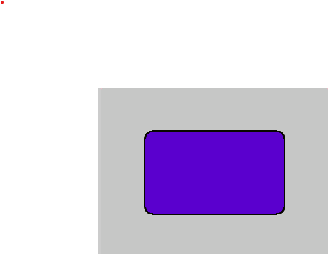
Box with Border
Border is useful when you need a clear outline — here a purple alert card with an amber highlight border.
{
  "elements": [
    {
      "type": "box",
      "name": "Screen",
      "x": 0, "y": 0, "w": 320, "h": 240,
      "color": "0xC6C6C6",
      "children": [
        {
          "type": "box",
          "name": "AlertCard",
          "x": 0, "y": 0, "w": 200, "h": 120,
          "color": "0x5900CC",
          "align": "MGUI_ALIGN_CENTER",
          "corner": { "radius": 12, "filled": true },
          "border": { "color": "0xFCB900", "width": 2 }
        }
      ]
    }
  ]
}
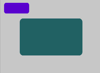
Clickable Box (Toggle Visibility)
Purple button toggles a teal panel. No borders — shape and color contrast are enough.
{
  "elements": [
    {
      "type": "box",
      "name": "Screen",
      "x": 0, "y": 0, "w": 320, "h": 240,
      "color": "0xC6C6C6",
      "children": [
        {
          "type": "box",
          "name": "Panel",
          "x": 0, "y": 0, "w": 200, "h": 120,
          "color": "0x246163",
          "align": "MGUI_ALIGN_CENTER",
          "corner": { "radius": 12, "filled": true }
        },
        {
          "type": "box",
          "name": "BtnToggle",
          "x": 10, "y": 10, "w": 80, "h": 36,
          "color": "0x5900CC",
          "corner": { "radius": 8, "filled": true }
        }
      ]
    }
  ]
}
static bool panel_visible = true;

static void toggle_click(mgui_widget_t* obj, mgui_event_t event) {
    if (event == MGUI_EVENT_CLICKED) {
        panel_visible = !panel_visible;
        mgui_widget_set_visible(panel, panel_visible);
    }
}

mgui_widget_t* panel = mgui_allocate_widget(
    screen, MGUI_WIDGET_BOX,
    (mgui_area_t){0, 0, 200, 120},
    MGUI_COLOR_TEAL);
mgui_widget_align(panel, MGUI_ALIGN_CENTER);
mgui_widget_radius_property(panel, 12, true);

mgui_widget_t* btn_box = mgui_allocate_widget(
    screen, MGUI_WIDGET_BOX,
    (mgui_area_t){10, 10, 80, 36},
    MGUI_COLOR_PURPLE);
mgui_widget_radius_property(btn_box, 8, true);
mgui_widget_click_handler(btn_box, toggle_click);
Common Combinations
| Use Case | Setup |
|---|---|
| Background screen | Full-size box as root parent |
| Card / panel | Rounded box, color contrast with parent |
| Divider | Thin box (height 2px) with contrasting color |
| Highlighted card | Rounded box + border (use sparingly) |
| Clickable tile | Box with click_handler, changes color on press |