Button Widget
Overview
The Button widget is a pressable rectangular control with an optional text label. It fires click events on tap/release and is the primary action trigger in a mGui UI.
Enable
No feature flag required — the Button widget is always available.
Creation
mgui_widget_t* btn = mgui_allocate_widget(
    parent,
    MGUI_WIDGET_BUTTON,
    (mgui_area_t){x, y, width, height},
    MGUI_COLOR_BLUE
);
API Reference
Label
// Set button text
mgui_widget_button_text(btn, "OK");

// Set text color
mgui_widget_button_text_color(btn, MGUI_COLOR_WHITE);
Appearance
mgui_widget_color_change(btn, MGUI_COLOR_ELEM_CYAN_BLUE);
mgui_widget_border_property(btn, MGUI_COLOR_WHITE, 1);
mgui_widget_radius_property(btn, 8, true);      // rounded button
mgui_widget_set_visible(btn, bool visible);
Events
static void btn_click(mgui_widget_t* obj, mgui_event_t event) {
    if (event == MGUI_EVENT_CLICKED) {
        // single tap
    }
    if (event == MGUI_EVENT_CLICK_HOLD) {
        // long press / held
    }
}
mgui_widget_click_handler(btn, btn_click);
Event Constants
| Event | Description |
|---|---|
MGUI_EVENT_CLICKED |
Finger released after a short tap |
MGUI_EVENT_CLICK_HOLD |
Button held down for a longer duration |
MGUI_EVENT_PRESS_DOWN |
Finger touched the button |
MGUI_EVENT_PRESS_UP |
Finger lifted |
Examples
Simple Action Button
mgui_widget_t* save_btn = mgui_allocate_widget(screen, MGUI_WIDGET_BUTTON,
    (mgui_area_t){300, 420, 120, 44}, MGUI_COLOR_ELEM_CYAN_BLUE);
mgui_widget_button_text(save_btn, "Save");
mgui_widget_button_text_color(save_btn, MGUI_COLOR_WHITE);
mgui_widget_radius_property(save_btn, 8, true);

static void save_click(mgui_widget_t* obj, mgui_event_t event) {
    if (event == MGUI_EVENT_CLICKED) {
        save_settings();
    }
}
mgui_widget_click_handler(save_btn, save_click);
Navigation Button (go to next screen)
mgui_widget_t* next_btn = mgui_allocate_widget(screen, MGUI_WIDGET_BUTTON,
    (mgui_area_t){650, 420, 120, 44}, MGUI_COLOR_ELEM_BLUE_INDIGO);
mgui_widget_button_text(next_btn, "Next >");
mgui_widget_button_text_color(next_btn, MGUI_COLOR_WHITE);

static void go_next(mgui_widget_t* obj, mgui_event_t event) {
    if (event == MGUI_EVENT_CLICKED) {
        mgui_widget_free_screen(&app.screen);
        app2_init();
    }
}
mgui_widget_click_handler(next_btn, go_next);
Danger / Confirmation Button
mgui_widget_t* del_btn = mgui_allocate_widget(screen, MGUI_WIDGET_BUTTON,
    (mgui_area_t){100, 300, 160, 44}, MGUI_COLOR_RED);
mgui_widget_button_text(del_btn, "Delete");
mgui_widget_button_text_color(del_btn, MGUI_COLOR_WHITE);
mgui_widget_border_property(del_btn, MGUI_COLOR_WHITE, 2);
mgui_widget_radius_property(del_btn, 6, true);
Button Row (OK / Cancel)
mgui_widget_t* ok_btn = mgui_allocate_widget(dialog, MGUI_WIDGET_BUTTON,
    (mgui_area_t){160, 200, 100, 40}, MGUI_COLOR_GREEN);
mgui_widget_button_text(ok_btn, "OK");
mgui_widget_button_text_color(ok_btn, MGUI_COLOR_WHITE);

mgui_widget_t* cancel_btn = mgui_allocate_widget(dialog, MGUI_WIDGET_BUTTON,
    (mgui_area_t){280, 200, 100, 40}, MGUI_COLOR_GRAY);
mgui_widget_button_text(cancel_btn, "Cancel");
mgui_widget_button_text_color(cancel_btn, MGUI_COLOR_WHITE);
Common Combinations
| Use Case | Pairing |
|---|---|
| Confirm dialog | Two buttons (OK + Cancel) inside a MessageBox |
| Toolbar button | Small icon-sized button with image child |
| Screen navigation | Button fires mgui_widget_free_screen + new init |
| Form submission | Button at bottom of a TextEdit form |
Examples
Basic Action Button
A centered blue "Save" button on a light gray background — the minimal starting point.

{
  "elements": [
    {
      "type": "box",
      "name": "Screen",
      "x": 0, "y": 0, "w": 320, "h": 240,
      "color": "0xC6C6C6",
      "children": [
        {
          "type": "button",
          "name": "SaveBtn",
          "x": 0, "y": 0, "w": 120, "h": 44,
          "color": "0x0055CC",
          "align": "MGUI_ALIGN_CENTER",
          "btn_text": "Save",
          "btn_text_color": "0xFFFFFF"
        }
      ]
    }
  ]
}
mgui_widget_t* screen = mgui_allocate_widget(
    NULL, MGUI_WIDGET_BOX,
    (mgui_area_t){0, 0, 320, 240},
    MGUI_COLOR_LIGHT_GRAY);

mgui_widget_t* btn = mgui_allocate_widget(
    screen, MGUI_WIDGET_BUTTON,
    (mgui_area_t){0, 0, 120, 44},
    MGUI_COLOR_ELEM_BLUE);
mgui_widget_align(btn, MGUI_ALIGN_CENTER);
mgui_widget_button_text(btn, "Save");
mgui_widget_button_text_color(btn, MGUI_COLOR_WHITE);
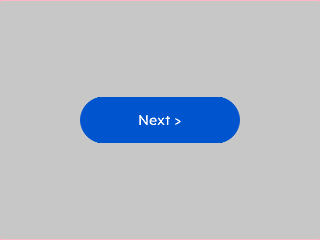
Rounded Button
Pill-style rounded button — set corner.radius to half the widget height for a fully rounded look.
{
  "elements": [
    {
      "type": "box",
      "name": "Screen",
      "x": 0, "y": 0, "w": 320, "h": 240,
      "color": "0xC6C6C6",
      "children": [
        {
          "type": "button",
          "name": "NextBtn",
          "x": 0, "y": 0, "w": 160, "h": 48,
          "color": "0x0055CC",
          "align": "MGUI_ALIGN_CENTER",
          "btn_text": "Next >",
          "btn_text_color": "0xFFFFFF",
          "corner": { "radius": 24, "filled": true }
        }
      ]
    }
  ]
}
mgui_widget_t* btn = mgui_allocate_widget(
    screen, MGUI_WIDGET_BUTTON,
    (mgui_area_t){0, 0, 160, 48},
    MGUI_COLOR_ELEM_BLUE);
mgui_widget_align(btn, MGUI_ALIGN_CENTER);
mgui_widget_button_text(btn, "Next >");
mgui_widget_button_text_color(btn, MGUI_COLOR_WHITE);
mgui_widget_button_set_radius(btn, 24);
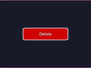
Danger Button
Red destructive action button with a white outline border — use for irreversible actions.
{
  "elements": [
    {
      "type": "box",
      "name": "Screen",
      "x": 0, "y": 0, "w": 320, "h": 240,
      "color": "0x1A1A2E",
      "children": [
        {
          "type": "button",
          "name": "DelBtn",
          "x": 0, "y": 0, "w": 160, "h": 44,
          "color": "0xCC0000",
          "align": "MGUI_ALIGN_CENTER",
          "btn_text": "Delete",
          "btn_text_color": "0xFFFFFF",
          "border": { "color": "0xFFFFFF", "width": 2 },
          "corner": { "radius": 6, "filled": true }
        }
      ]
    }
  ]
}
mgui_widget_t* btn = mgui_allocate_widget(
    screen, MGUI_WIDGET_BUTTON,
    (mgui_area_t){0, 0, 160, 44},
    MGUI_COLOR_RED);
mgui_widget_align(btn, MGUI_ALIGN_CENTER);
mgui_widget_button_text(btn, "Delete");
mgui_widget_button_text_color(btn, MGUI_COLOR_WHITE);
mgui_widget_border_property(btn, MGUI_COLOR_WHITE, 2);
mgui_widget_button_set_radius(btn, 6);
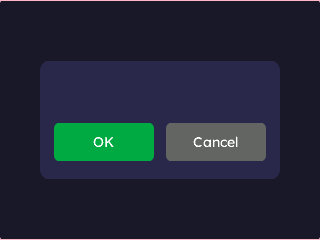
Button Row (OK / Cancel)
Two buttons side-by-side inside a dark dialog panel — primary action left, dismiss right.
{
  "elements": [
    {
      "type": "box",
      "name": "Screen",
      "x": 0, "y": 0, "w": 320, "h": 240,
      "color": "0x1A1A2E",
      "children": [
        {
          "type": "box",
          "name": "Dialog",
          "x": 40, "y": 60, "w": 240, "h": 120,
          "color": "0x2A2A4E",
          "corner": { "radius": 10, "filled": true },
          "children": [
            {
              "type": "button",
              "name": "OkBtn",
              "x": 14, "y": 62, "w": 100, "h": 40,
              "color": "0x00AA44",
              "btn_text": "OK",
              "btn_text_color": "0xFFFFFF",
              "corner": { "radius": 6, "filled": true }
            },
            {
              "type": "button",
              "name": "CancelBtn",
              "x": 126, "y": 62, "w": 100, "h": 40,
              "color": "0x666666",
              "btn_text": "Cancel",
              "btn_text_color": "0xFFFFFF",
              "corner": { "radius": 6, "filled": true }
            }
          ]
        }
      ]
    }
  ]
}
mgui_widget_t* dialog = mgui_allocate_widget(
    screen, MGUI_WIDGET_BOX,
    (mgui_area_t){40, 60, 240, 120},
    (mgui_color_t){.value = 0x2A2A4E});
mgui_widget_box_set_radius(dialog, 10);

mgui_widget_t* ok = mgui_allocate_widget(
    dialog, MGUI_WIDGET_BUTTON,
    (mgui_area_t){14, 62, 100, 40},
    MGUI_COLOR_GREEN);
mgui_widget_button_text(ok, "OK");
mgui_widget_button_text_color(ok, MGUI_COLOR_WHITE);
mgui_widget_button_set_radius(ok, 6);

mgui_widget_t* cancel = mgui_allocate_widget(
    dialog, MGUI_WIDGET_BUTTON,
    (mgui_area_t){126, 62, 100, 40},
    MGUI_COLOR_GRAY_DEFAULT);
mgui_widget_button_text(cancel, "Cancel");
mgui_widget_button_text_color(cancel, MGUI_COLOR_WHITE);
mgui_widget_button_set_radius(cancel, 6);