Container Widget
Overview
The Container widget is a scrollable panel that groups child widgets. Vertical and horizontal scrollbars appear automatically when children extend beyond the visible area. Use it for settings pages, list views, dashboards, and any layout that needs a bounded, scrollable region.
Enable
Creation
mgui_widget_t* panel = mgui_allocate_widget(
    parent,
    MGUI_WIDGET_CONTAINER,
    (mgui_area_t){x, y, width, height},
    MGUI_COLOR_PURPLE
);
API Reference
Common Helpers (all widgets)
mgui_widget_set_pos(panel, x, y);
mgui_widget_set_size(panel, width, height);
mgui_widget_border_property(panel, MGUI_COLOR_WHITE, 1);
mgui_widget_color_change(panel, MGUI_COLOR_PURPLE);
mgui_widget_radius_property(panel, 8, true);
mgui_widget_set_visible(panel, true);
mgui_widget_align(panel, MGUI_ALIGN_CENTER);
Adding Children
Any widget becomes a child of the container by passing it as the parent argument:
mgui_widget_t* lbl = mgui_allocate_widget(panel, MGUI_WIDGET_LABEL,
    (mgui_area_t){10, 10, 200, 28}, MGUI_COLOR_PURPLE);
mgui_widget_label_set_text(lbl, "Hello");
mgui_widget_color_change(lbl, MGUI_COLOR_WHITE);   // contrast against purple background
Vertical Scrollbar
// Customize colors: track, thumb, arrow buttons
mgui_widget_container_set_vscrollbar_colors(panel,
    MGUI_COLOR_DARK_GRAY,   // track
    MGUI_COLOR_EMERALD,     // thumb
    MGUI_COLOR_ORANGE);     // buttons

mgui_widget_container_set_vscrollbar_width(panel, 16);         // strip width in px (0 = default)
mgui_widget_container_set_vscrollbar_show_arrows(panel, true); // show ▲ ▼ buttons
Horizontal Scrollbar
// Customize colors: track, thumb, arrow buttons
mgui_widget_container_set_hscrollbar_colors(panel,
    MGUI_COLOR_DARK_GRAY,   // track
    MGUI_COLOR_CYAN,        // thumb
    MGUI_COLOR_ORANGE);     // buttons

mgui_widget_container_set_hscrollbar_height(panel, 16);         // strip height in px (0 = default)
mgui_widget_container_set_hscrollbar_show_arrows(panel, true);  // show ◄ ► buttons
Examples
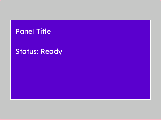
Basic Panel
A rounded, bordered container with two label children — the minimal starting point.
{
  "elements": [
    {
      "type": "box",
      "name": "Screen",
      "x": 0, "y": 0, "w": 320, "h": 240,
      "color": "0xC6C6C6",
      "children": [
        {
          "type": "container",
          "name": "Panel",
          "x": 0, "y": 0, "w": 280, "h": 160,
          "color": "0x5900CC",
          "align": "MGUI_ALIGN_CENTER",
          "corner": { "radius": 8, "filled": true },
          "border": { "color": "0xFFFFFF", "width": 1 },
          "children": [
            {
              "type": "label",
              "name": "Title",
              "x": 10, "y": 10, "w": 240, "h": 28,
              "color": "0xFFFFFF",
              "text": "Panel Title"
            },
            {
              "type": "label",
              "name": "Info",
              "x": 10, "y": 50, "w": 240, "h": 22,
              "color": "0xFFFFFF",
              "text": "Status: Ready"
            }
          ]
        }
      ]
    }
  ]
}
mgui_widget_t* screen = mgui_allocate_widget(
    NULL, MGUI_WIDGET_BOX,
    (mgui_area_t){0, 0, 320, 240},
    MGUI_COLOR_LIGHT_GRAY);

mgui_widget_t* panel = mgui_allocate_widget(
    screen, MGUI_WIDGET_CONTAINER,
    (mgui_area_t){0, 0, 280, 160},
    MGUI_COLOR_PURPLE);
mgui_widget_align(panel, MGUI_ALIGN_CENTER);
mgui_widget_radius_property(panel, 8, true);
mgui_widget_border_property(panel, MGUI_COLOR_WHITE, 1);

mgui_widget_t* title = mgui_allocate_widget(
    panel, MGUI_WIDGET_LABEL,
    (mgui_area_t){10, 10, 240, 28},
    MGUI_COLOR_WHITE);
mgui_widget_label_set_text(title, "Panel Title");

mgui_widget_t* info = mgui_allocate_widget(
    panel, MGUI_WIDGET_LABEL,
    (mgui_area_t){10, 50, 240, 22},
    MGUI_COLOR_WHITE);
mgui_widget_label_set_text(info, "Status: Ready");
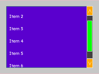
Scrollable List
A container whose children extend beyond its height — the vertical scrollbar appears automatically.
{
  "elements": [
    {
      "type": "box",
      "name": "Screen",
      "x": 0, "y": 0, "w": 320, "h": 240,
      "color": "0xC6C6C6",
      "children": [
        {
          "type": "container",
          "name": "ListPanel",
          "x": 20, "y": 20, "w": 280, "h": 200,
          "color": "0x5900CC",
          "border": { "color": "0x2DA852", "width": 2 },
          "corner": { "radius": 6, "filled": true },
          "children": [
            { "type": "label", "name": "Item1", "x": 10, "y": 10,  "w": 220, "h": 30, "color": "0xFFFFFF", "text": "Item 1" },
            { "type": "label", "name": "Item2", "x": 10, "y": 50,  "w": 220, "h": 30, "color": "0xFFFFFF", "text": "Item 2" },
            { "type": "label", "name": "Item3", "x": 10, "y": 90,  "w": 220, "h": 30, "color": "0xFFFFFF", "text": "Item 3" },
            { "type": "label", "name": "Item4", "x": 10, "y": 130, "w": 220, "h": 30, "color": "0xFFFFFF", "text": "Item 4" },
            { "type": "label", "name": "Item5", "x": 10, "y": 170, "w": 220, "h": 30, "color": "0xFFFFFF", "text": "Item 5" },
            { "type": "label", "name": "Item6", "x": 10, "y": 210, "w": 220, "h": 30, "color": "0xFFFFFF", "text": "Item 6" },
            { "type": "label", "name": "Item7", "x": 10, "y": 250, "w": 220, "h": 30, "color": "0xFFFFFF", "text": "Item 7" }
          ]
        }
      ]
    }
  ]
}
mgui_widget_t* screen = mgui_allocate_widget(
    NULL, MGUI_WIDGET_BOX,
    (mgui_area_t){0, 0, 320, 240},
    MGUI_COLOR_LIGHT_GRAY);

mgui_widget_t* list = mgui_allocate_widget(
    screen, MGUI_WIDGET_CONTAINER,
    (mgui_area_t){20, 20, 280, 200},
    MGUI_COLOR_PURPLE);
mgui_widget_border_property(list, MGUI_COLOR_EMERALD, 2);
mgui_widget_radius_property(list, 6, true);

// Scrollbar: green thumb on dark track
mgui_widget_container_set_vscrollbar_colors(list,
    MGUI_COLOR_DARK_GRAY, MGUI_COLOR_EMERALD, MGUI_COLOR_ORANGE);

// Seven rows — last three extend past the 200 px viewport, triggering the scrollbar
const char* items[] = {
    "Item 1", "Item 2", "Item 3", "Item 4", "Item 5", "Item 6", "Item 7"
};
for (int i = 0; i < 7; i++) {
    mgui_widget_t* row = mgui_allocate_widget(list, MGUI_WIDGET_LABEL,
        (mgui_area_t){10, 10 + i * 40, 220, 30},
        MGUI_COLOR_WHITE);
    mgui_widget_label_set_text(row, items[i]);
}
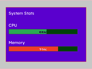
Dashboard Card
A styled card container holding a title and two progress bars — CPU and memory at a glance.
{
  "elements": [
    {
      "type": "box",
      "name": "Screen",
      "x": 0, "y": 0, "w": 320, "h": 240,
      "color": "0xC6C6C6",
      "children": [
        {
          "type": "container",
          "name": "Card",
          "x": 20, "y": 20, "w": 280, "h": 190,
          "color": "0x5900CC",
          "align": "MGUI_ALIGN_CENTER",
          "corner": { "radius": 10, "filled": true },
          "border": { "color": "0xEF3F2E", "width": 2 },
          "children": [
            {
              "type": "label",
              "name": "CardTitle",
              "x": 10, "y": 8, "w": 240, "h": 28,
              "color": "0xFFFFFF",
              "text": "System Stats"
            },
            {
              "type": "label",
              "name": "CpuLabel",
              "x": 10, "y": 50, "w": 100, "h": 22,
              "color": "0xFFFFFF",
              "text": "CPU"
            },
            {
              "type": "progress_bar",
              "name": "CpuBar",
              "x": 10, "y": 76, "w": 240, "h": 18,
              "color": "0x4208",
              "value": 55,
              "bar_color": "0x2DA852",
              "show_percentage": true
            },
            {
              "type": "label",
              "name": "MemLabel",
              "x": 10, "y": 110, "w": 100, "h": 22,
              "color": "0xFFFFFF",
              "text": "Memory"
            },
            {
              "type": "progress_bar",
              "name": "MemBar",
              "x": 10, "y": 136, "w": 240, "h": 18,
              "color": "0x4208",
              "value": 72,
              "bar_color": "0xEF3F2E",
              "show_percentage": true
            }
          ]
        }
      ]
    }
  ]
}
mgui_widget_t* screen = mgui_allocate_widget(
    NULL, MGUI_WIDGET_BOX,
    (mgui_area_t){0, 0, 320, 240},
    MGUI_COLOR_LIGHT_GRAY);

mgui_widget_t* card = mgui_allocate_widget(
    screen, MGUI_WIDGET_CONTAINER,
    (mgui_area_t){20, 20, 280, 190},
    MGUI_COLOR_PURPLE);
mgui_widget_align(card, MGUI_ALIGN_CENTER);
mgui_widget_radius_property(card, 10, true);
mgui_widget_border_property(card, MGUI_COLOR_CRIMSON, 2);

mgui_widget_t* card_title = mgui_allocate_widget(
    card, MGUI_WIDGET_LABEL,
    (mgui_area_t){10, 8, 240, 28},
    MGUI_COLOR_WHITE);
mgui_widget_label_set_text(card_title, "System Stats");

mgui_widget_t* cpu_lbl = mgui_allocate_widget(
    card, MGUI_WIDGET_LABEL,
    (mgui_area_t){10, 50, 100, 22},
    MGUI_COLOR_WHITE);
mgui_widget_label_set_text(cpu_lbl, "CPU");

mgui_widget_t* cpu_bar = mgui_allocate_widget(
    card, MGUI_WIDGET_PROGRESS_BAR,
    (mgui_area_t){10, 76, 240, 18},
    MGUI_COLOR_DARK_GRAY);
mgui_widget_progress_bar_set_value(cpu_bar, 55);
mgui_widget_progress_bar_set_bar_color(cpu_bar, MGUI_COLOR_EMERALD);
mgui_widget_progress_bar_show_percentage(cpu_bar, true);

mgui_widget_t* mem_lbl = mgui_allocate_widget(
    card, MGUI_WIDGET_LABEL,
    (mgui_area_t){10, 110, 100, 22},
    MGUI_COLOR_WHITE);
mgui_widget_label_set_text(mem_lbl, "Memory");

mgui_widget_t* mem_bar = mgui_allocate_widget(
    card, MGUI_WIDGET_PROGRESS_BAR,
    (mgui_area_t){10, 136, 240, 18},
    MGUI_COLOR_DARK_GRAY);
mgui_widget_progress_bar_set_value(mem_bar, 72);
mgui_widget_progress_bar_set_bar_color(mem_bar, MGUI_COLOR_CRIMSON);
mgui_widget_progress_bar_show_percentage(mem_bar, true);
Common Combinations
| Use Case | Contents |
|---|---|
| Dashboard card | Label (header) + progress bars or value labels |
| Settings group | Section label + checkboxes / dropdowns |
| Scrollable menu | Many label rows — vertical scrollbar auto-appears |
| Popup panel | Hidden container revealed by a toggle button |