Checkbox Widget
Overview
The Checkbox widget is a two-state control (checked / unchecked) with an optional text label. Multiple checkboxes can be used independently — unlike radio buttons, any number can be checked simultaneously.
Enable
No feature flag required — the Checkbox widget is always available.
Creation
mgui_widget_t* cb = mgui_allocate_widget(
    parent,
    MGUI_WIDGET_CHECKBOX,
    (mgui_area_t){x, y, width, height},
    MGUI_COLOR_WHITE
);
API Reference
State
// Read state
bool is_on = mgui_widget_checkbox_is_checked(cb);

// Programmatically set state
mgui_widget_checkbox_set_checked(cb, true);
mgui_widget_checkbox_set_checked(cb, false);
Label
// Set label text
mgui_widget_checkbox_set_text(cb, "Enable notifications");

// Set label text color
mgui_widget_checkbox_set_text_color(cb, MGUI_COLOR_BLACK);
Appearance
mgui_widget_checkbox_box_size(cb, 20);           // box side length in pixels
mgui_widget_checkbox_set_font_type(cb, font);    // built-in font for label
mgui_widget_color_change(cb, MGUI_COLOR_WHITE);
mgui_widget_border_property(cb, MGUI_COLOR_GRAY, 1);
mgui_widget_set_visible(cb, bool visible);
Events
static void cb_click(mgui_widget_t* obj, mgui_event_t event) {
    if (event == MGUI_EVENT_CLICKED) {
        if (mgui_widget_checkbox_is_checked(obj)) {
            mgui_widget_checkbox_set_text(obj, "Option: ON");
        } else {
            mgui_widget_checkbox_set_text(obj, "Option: OFF");
        }
    }
}
mgui_widget_click_handler(cb, cb_click);
Event Constants
| Event | Description |
|---|---|
MGUI_EVENT_CLICKED |
State toggled — finger released after a short tap |
MGUI_EVENT_PRESS_DOWN |
Finger touched the checkbox |
MGUI_EVENT_PRESS_UP |
Finger lifted |
Common Combinations
| Use Case | Pairing |
|---|---|
| Settings list | Column of checkboxes inside a scrollable container |
| Feature flags | Checkbox enables/disables subsystem |
| Form validation | Read all checkbox states before submission |
| Conditional visibility | Checkbox controls mgui_widget_set_visible |
Examples
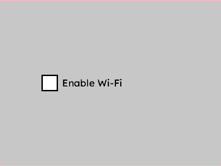
Basic Checkbox
A single centered checkbox on a light gray background — the minimal starting point.
{
  "elements": [
    {
      "type": "box",
      "name": "Screen",
      "x": 0, "y": 0, "w": 320, "h": 240,
      "color": "0xC6C6C6",
      "children": [
        {
          "type": "checkbox",
          "name": "EnableWifi",
          "x": 0, "y": 0, "w": 200, "h": 30,
          "color": "0x000000",
          "align": "MGUI_ALIGN_CENTER",
          "cb_text": "Enable Wi-Fi",
          "cb_text_color": "0x000000"
        }
      ]
    }
  ]
}
mgui_widget_t* screen = mgui_allocate_widget(
    NULL, MGUI_WIDGET_BOX,
    (mgui_area_t){0, 0, 320, 240},
    MGUI_COLOR_LIGHT_GRAY);

mgui_widget_t* enable_wifi = mgui_allocate_widget(
    screen, MGUI_WIDGET_CHECKBOX,
    (mgui_area_t){0, 0, 200, 30},
    MGUI_COLOR_WHITE);
mgui_widget_align(enable_wifi, MGUI_ALIGN_CENTER);
mgui_widget_checkbox_set_text(enable_wifi, "Enable Wi-Fi");
mgui_widget_checkbox_set_text_color(enable_wifi, MGUI_COLOR_BLACK);
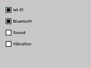
Settings Panel (Multiple Checkboxes)
Four options stacked inside a panel — each pre-checked, using a custom box size.
{
  "elements": [
    {
      "type": "box",
      "name": "Screen",
      "x": 0, "y": 0, "w": 320, "h": 240,
      "color": "0xC6C6C6",
      "children": [
        {
          "type": "checkbox",
          "name": "CbWifi",
          "x": 20, "y": 20, "w": 220, "h": 30,
          "color": "0x000000",
          "cb_text": "Wi-Fi",
          "cb_text_color": "0x000000",
          "checked": true,
          "cb_box_size": 20
        },
        {
          "type": "checkbox",
          "name": "CbBluetooth",
          "x": 20, "y": 60, "w": 220, "h": 30,
          "color": "0x000000",
          "cb_text": "Bluetooth",
          "cb_text_color": "0x000000",
          "checked": true,
          "cb_box_size": 20
        },
        {
          "type": "checkbox",
          "name": "CbSound",
          "x": 20, "y": 100, "w": 220, "h": 30,
          "color": "0x000000",
          "cb_text": "Sound",
          "cb_text_color": "0x000000",
          "checked": false,
          "cb_box_size": 20
        },
        {
          "type": "checkbox",
          "name": "CbVibration",
          "x": 20, "y": 140, "w": 220, "h": 30,
          "color": "0x000000",
          "cb_text": "Vibration",
          "cb_text_color": "0x000000",
          "checked": false,
          "cb_box_size": 20
        }
      ]
    }
  ]
}
mgui_widget_t* screen = mgui_allocate_widget(
    NULL, MGUI_WIDGET_BOX,
    (mgui_area_t){0, 0, 320, 240},
    MGUI_COLOR_LIGHT_GRAY);

const char* labels[] = {"Wi-Fi", "Bluetooth", "Sound", "Vibration"};
bool defaults[]       = {true,    true,        false,   false};

for (int i = 0; i < 4; i++) {
    mgui_widget_t* cb = mgui_allocate_widget(
        screen, MGUI_WIDGET_CHECKBOX,
        (mgui_area_t){20, 20 + i * 40, 220, 30},
        MGUI_COLOR_WHITE);
    mgui_widget_checkbox_set_text(cb, labels[i]);
    mgui_widget_checkbox_set_text_color(cb, MGUI_COLOR_BLACK);
    mgui_widget_checkbox_set_checked(cb, defaults[i]);
    mgui_widget_checkbox_box_size(cb, 20);
}
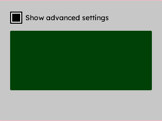
Checkbox Controlling Conditional Visibility
A checkbox that shows or hides a detail panel beneath it — wired via a click handler.
{
  "elements": [
    {
      "type": "box",
      "name": "Screen",
      "x": 0, "y": 0, "w": 320, "h": 240,
      "color": "0xC6C6C6",
      "children": [
        {
          "type": "checkbox",
          "name": "AdvancedToggle",
          "x": 20, "y": 20, "w": 220, "h": 30,
          "color": "0x000000",
          "cb_text": "Show advanced settings",
          "cb_text_color": "0x000000"
        },
        {
          "type": "box",
          "name": "AdvancedPanel",
          "x": 20, "y": 60, "w": 280, "h": 120,
          "color": "0x4208",
          "visible": false
        }
      ]
    }
  ],
  "connections": [
    { "from": "AdvancedToggle", "to": "AdvancedPanel", "action": "toggle_visible" }
  ]
}
mgui_widget_t* screen = mgui_allocate_widget(
    NULL, MGUI_WIDGET_BOX,
    (mgui_area_t){0, 0, 320, 240},
    MGUI_COLOR_LIGHT_GRAY);

mgui_widget_t* adv_cb = mgui_allocate_widget(
    screen, MGUI_WIDGET_CHECKBOX,
    (mgui_area_t){20, 20, 220, 30},
    MGUI_COLOR_BLACK);
mgui_widget_checkbox_set_text(adv_cb, "Show advanced settings");
mgui_widget_checkbox_set_text_color(adv_cb, MGUI_COLOR_BLACK);

mgui_widget_t* adv_panel = mgui_allocate_widget(
    screen, MGUI_WIDGET_BOX,
    (mgui_area_t){20, 60, 280, 120},
    MGUI_COLOR_DARK_GRAY);
mgui_widget_set_visible(adv_panel, false);

static mgui_widget_t* s_adv_panel = NULL;
s_adv_panel = adv_panel;

static void on_adv_toggle(mgui_widget_t* obj, mgui_event_t event) {
    if (event == MGUI_EVENT_CLICKED) {
        mgui_widget_set_visible(s_adv_panel,
            mgui_widget_checkbox_is_checked(obj));
    }
}
mgui_widget_click_handler(adv_cb, on_adv_toggle);