Toggle Button Widget
Overview
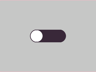
The Toggle Button is a two-state button — either ON (checked) or OFF (unchecked). It fires MGUI_EVENT_CLICKED on every tap and visually reflects its state via configurable ON/OFF/knob colors.
Enable
No feature flag required — the Toggle Button is always available.
Creation
mgui_widget_t* toggle = mgui_allocate_widget(
    parent,
    MGUI_WIDGET_TOGGLE_BUTTON,
    (mgui_area_t){x, y, width, height},
    MGUI_COLOR_ELEM_DARK_SLATE
);
API Reference
State
// Read current state
bool on = mgui_widget_toggle_button_is_checked(toggle);

// Set state programmatically
mgui_widget_toggle_button_set_checked(toggle, true);
Appearance
// on color, off color, knob color
mgui_widget_toggle_button_set_colors(toggle,
    MGUI_COLOR_EMERALD,
    MGUI_COLOR_ELEM_DARK_SLATE,
    MGUI_COLOR_WHITE);

mgui_widget_radius_property(toggle, 10, true);
mgui_widget_border_property(toggle, MGUI_COLOR_WHITE, 1);
Events
static void on_toggle(mgui_widget_t* obj, mgui_event_t event) {
    if (event == MGUI_EVENT_CLICKED) {
        if (mgui_widget_toggle_button_is_checked(obj)) {
            // now ON
        } else {
            // now OFF
        }
    }
}
mgui_widget_click_handler(toggle, on_toggle);
Common Combinations
| Use Case | Setup |
|---|---|
| Feature enable/disable | Toggle + label showing current state |
| Panel show/hide | Toggle drives mgui_widget_set_visible on a box |
| Multi-option selector | Row of toggles acting as an option group |
Examples
ON/OFF Switch with Status Label
A centered toggle that switches between emerald (ON) and crimson (OFF) and updates a status label — covers toggle_colors, toggle_checked, radius, and the click callback.
{
  "elements": [
    {
      "type": "box",
      "name": "Screen",
      "x": 0, "y": 0, "w": 320, "h": 240,
      "color": "0xC6C6C6",
      "children": [
        {
          "type": "toggle",
          "name": "PowerToggle",
          "x": 0, "y": 80, "w": 120, "h": 44,
          "color": "0x3A2939",
          "align": "MGUI_ALIGN_CENTER",
          "toggle_checked": false,
          "toggle_colors": {
            "on":   "0x2DA852",
            "off":  "0x3A2939",
            "knob": "0xFFFFFF"
          },
          "corner": { "radius": 10, "filled": true }
        },
        {
          "type": "label",
          "name": "StatusLabel",
          "x": 0, "y": 140, "w": 320, "h": 28,
          "color": "0xC6C6C6",
          "align": "MGUI_ALIGN_CENTER",
          "text": "Status: OFF"
        }
      ]
    }
  ]
}
mgui_widget_t* screen = mgui_allocate_widget(
    NULL, MGUI_WIDGET_BOX,
    (mgui_area_t){0, 0, 320, 240},
    MGUI_COLOR_LIGHT_GRAY);

mgui_widget_t* pwr_toggle = mgui_allocate_widget(
    screen, MGUI_WIDGET_TOGGLE_BUTTON,
    (mgui_area_t){0, 80, 120, 44},
    MGUI_COLOR_ELEM_DARK_SLATE);
mgui_widget_align(pwr_toggle, MGUI_ALIGN_CENTER);
mgui_widget_toggle_button_set_checked(pwr_toggle, false);
mgui_widget_toggle_button_set_colors(pwr_toggle,
    MGUI_COLOR_EMERALD,
    MGUI_COLOR_ELEM_DARK_SLATE,
    MGUI_COLOR_WHITE);
mgui_widget_radius_property(pwr_toggle, 10, true);

mgui_widget_t* status_lbl = mgui_allocate_widget(
    screen, MGUI_WIDGET_LABEL,
    (mgui_area_t){0, 140, 320, 28},
    MGUI_COLOR_LIGHT_GRAY);
mgui_widget_align(status_lbl, MGUI_ALIGN_CENTER);
mgui_widget_label_set_text(status_lbl, "Status: OFF");
mgui_widget_color_change(status_lbl, MGUI_COLOR_ELEM_DARK_SLATE);

static void on_power(mgui_widget_t* obj, mgui_event_t event) {
    if (event == MGUI_EVENT_CLICKED) {
        if (mgui_widget_toggle_button_is_checked(obj)) {
            mgui_widget_label_set_text(status_lbl, "Status: ON");
        } else {
            mgui_widget_label_set_text(status_lbl, "Status: OFF");
        }
    }
}
mgui_widget_click_handler(pwr_toggle, on_power);
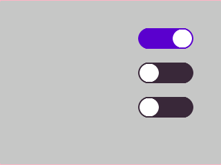
Toggle Row (Settings Panel)
Three independent toggle switches in a column — each with its own on/off colors — showing the typical settings-panel pattern.
{
  "elements": [
    {
      "type": "box",
      "name": "Screen",
      "x": 0, "y": 0, "w": 320, "h": 240,
      "color": "0xC6C6C6",
      "children": [
        {
          "type": "toggle",
          "name": "WifiToggle",
          "x": 200, "y": 40, "w": 80, "h": 32,
          "color": "0x3A2939",
          "toggle_checked": true,
          "toggle_colors": { "on": "0x5900CC", "off": "0x3A2939", "knob": "0xFFFFFF" },
          "corner": { "radius": 8, "filled": true }
        },
        {
          "type": "toggle",
          "name": "BtToggle",
          "x": 200, "y": 90, "w": 80, "h": 32,
          "color": "0x3A2939",
          "toggle_checked": false,
          "toggle_colors": { "on": "0x5900CC", "off": "0x3A2939", "knob": "0xFFFFFF" },
          "corner": { "radius": 8, "filled": true }
        },
        {
          "type": "toggle",
          "name": "GpsToggle",
          "x": 200, "y": 140, "w": 80, "h": 32,
          "color": "0x3A2939",
          "toggle_checked": false,
          "toggle_colors": { "on": "0x2DA852", "off": "0x3A2939", "knob": "0xFFFFFF" },
          "corner": { "radius": 8, "filled": true }
        }
      ]
    }
  ]
}
// Helper to create one row toggle
static mgui_widget_t* make_toggle(mgui_widget_t* parent,
                                   int16_t y, bool on,
                                   mgui_color_t on_color) {
    mgui_widget_t* t = mgui_allocate_widget(
        parent, MGUI_WIDGET_TOGGLE_BUTTON,
        (mgui_area_t){200, y, 80, 32},
        MGUI_COLOR_ELEM_DARK_SLATE);
    mgui_widget_toggle_button_set_checked(t, on);
    mgui_widget_toggle_button_set_colors(t,
        on_color,
        MGUI_COLOR_ELEM_DARK_SLATE,
        MGUI_COLOR_WHITE);
    mgui_widget_radius_property(t, 8, true);
    return t;
}

mgui_widget_t* wifi_t = make_toggle(screen,  40, true,  MGUI_COLOR_PURPLE);
mgui_widget_t* bt_t   = make_toggle(screen,  90, false, MGUI_COLOR_PURPLE);
mgui_widget_t* gps_t  = make_toggle(screen, 140, false, MGUI_COLOR_EMERALD);